By clicking “Accept All Cookies”, you agree to the storing of cookies on your device to enhance site navigation, analyze site usage and assist in our marketing efforts.
By clicking “Accept All Cookies”, you agree to the storing of cookies on your device to enhance site navigation, analyze site usage and assist in our marketing efforts.
Enhancing Interactivity in Tableau Dashboards with Dynamic Parameters
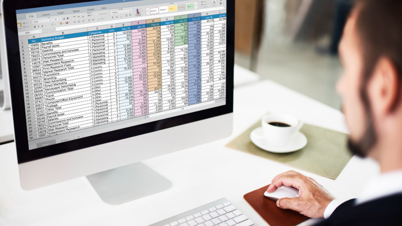
In Tableau, parameters are dynamic values that can be used to create user controls in dashboards. Parameters allow users to adjust or filter data, change visualizations, and interact with the dashboard in a more flexible and customized way.A parameter is a single, dynamic value that can be used in calculations, filters, or reference lines. Users can manually enter or select values to adjust the visualization.
How to create a parameter:
Right click in the data pane and select create parameter and then you have to define the parameter. Data type are Integer, Float, Date and String etc.Allowable values are: All – any value within the data type.List – predefined list of values.Range – defined range of values.There are many examples how you can use parameters in Tableau.
Top N Filter
Allow the user to control how many top performing categories are displayed in a chart.e.g. Products, sales regionsName – Top N, Data type – Integer Allowable values: Range (1 to 100)Use case: create a calculated field using the ‘INDEX()’ Function:SQL: IF INDEX() <= [Top N] THEN [category] ENDAdd the calculated field to the filters shelf and set it to “non-null” values.Result: the user can select how many top categories like top 5 or top 10 they want to display on chart.
Other Method are Rank Calculation:
There are a variety of different RANK functions which work in slightly different ways. RANK_UNIQUE, for instance, assigns each row a unique rank so it will not show ties.
However, RANK is a little harder to mess up since it’s ranking the sales measure, not simply counting rows like INDEX. Nonetheless, we have to be careful to ensure that everything is computed properly.SQL:IF RANK(SUM([Sales])) <= [Top N] THEN"Show"ELSE"Hide"END
Dynamic Measure selections
Allow the user to switch between different measures in the same visualisation.e.g. sales, profit and quantityName – Measure selector, Data type – String, Allowable values: List (‘Sales’, ‘Profit’, ‘Quantity’)Use case: create a calculated fieldSQL:CASE [Measure Selector]WHEN "Sales" THEN [Sales]WHEN "Profit" THEN [Profit]WHEN "Quantity" THEN [Quantity]ENDUse this calculated field in the chart to display the measure based on the user’s selection.Result: The chart will update dynamically based on whether the user selects "Sales", "Profit", or "Quantity" from the parameter control.
Date Range Filter
Users choose between different pre-set date ranges e.g. Last 7 Days, Last 30 Days, Last Year).Name – Date Range, Data type – String, Allowable values: List (‘Last 7 Days’, ‘Last 30 Days’, ‘Last Year’)SQL:IF [Date Range] = "Last 7 Days" THENDATEDIFF('day', [Order Date], TODAY()) <= 7ELSEIF [Date Range] = "Last 30 Days" THENDATEDIFF('day', [Order Date], TODAY()) <= 30ELSEIF [Date Range] = "Last Year" THENYEAR([Order Date]) = YEAR(TODAY()) - 1ENDResult: Users can switch between different time ranges, and the chart will update accordingly.
What-If Analysis
Provide a slider to allow users to adjust a growth rate and see how it impacts projected sales.Name – Growth rate, Data type – Float, Allowable values: Range (0.00 to 1.00) with a step size of 0.01Use case: create a calculated field for projected sales:SQL:[Sales] (1 + [Growth Rate])Use this calculated field in a visualization to display projected sales.Result: Users can adjust the `Growth Rate` parameter with a slider, and the projected sales will update dynamically based on the user’s input.
Dynamic Sorting
Allow users to change the sort order of a chart between different measures.e.g., sort by Sales or by Profit.Name – Sort By, Data type – String, Allowable values: List (‘Sales’, ‘Profit’)Use Case: Create a calculated field:SQL:CASE [Sort By]WHEN "Sales" THEN [Sales]WHEN "Profit" THEN [Profit]ENDAdd this calculated field to the sort control of the visualization.Result: The chart will sort based on the user’s selection, allowing the user to choose between sorting by Sales or Profit.Reference Line ControlScenario: Provide a parameter to let the user control the position of a reference line (e.g., a goal line for sales).- Parameter:- Name: `Sales Goal`- Data Type: Integer- Allowable Values: Range (1000 to 1000000)- Use Case:- Add a reference line to the chart, using the parameter `Sales Goal` as the value for the reference line.- Result: Users can adjust the reference line's value to see how close actual sales are to the goal they set.
Switch Between Aggregations
Allow the user to switch between different aggregate functions, such as SUM, AVG, or COUNT.Parameter: Name: Aggregation Type, Data Type: String, Allowable Values: List (`SUM`, `AVG`, `COUNT`)Use Case: Create a calculated field:SQLCASE [Aggregation Type]WHEN "SUM" THEN SUM([Sales])WHEN "AVG" THEN AVG([Sales])WHEN "COUNT" THEN COUNT([Sales])ENDUse this calculated field in the chart.Result: Users can toggle between different aggregation types to view the data as a sum, average, or count.Each of these examples demonstrates how parameters can be used to make dashboards more interactive and flexible for the end user, providing dynamic controls for filters, sorting, or calculations.
Parameter Formatting and Display Options:
Parameter Format: You can format the display of parameter values, such as adding currency symbols or percentage signs.Slider, Dropdown, and Input Box: Choose how the parameter control is displayed, either as a dropdown list, slider, or input box based on the allowable values.
Dynamic Parameter Updates (Tableau 2020.1 and later):
In Tableau 2020.1 and newer versions, parameters can dynamically update based on data changes, making them more responsive to data updates in real-time.Parameters can significantly enhance user interactivity in Tableau dashboards by making them customizable, dynamic, and user driven.